Chemistry of Space
Lecture and Exhibit - University of Miami School of Architecture - 2019
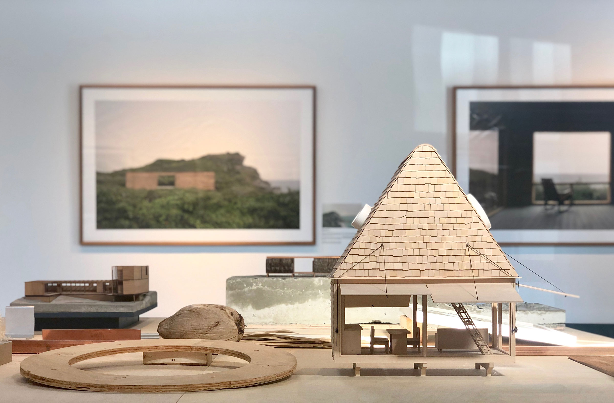

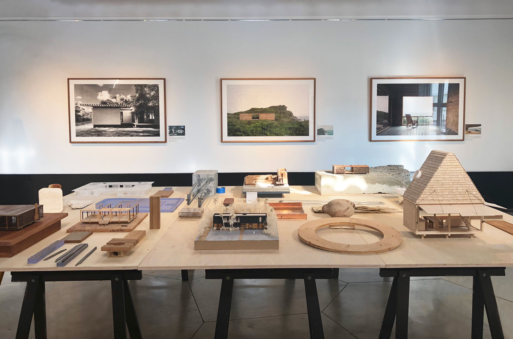
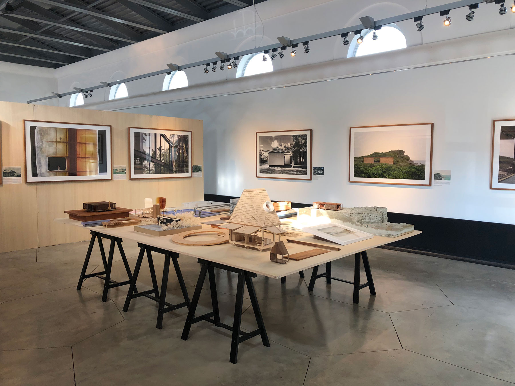
The exhibit features nine framed photographs (40” x 60”) of recent design projects by Brillhart Architecture, along with two finished paintings by Jacob Brillhart, and a large table of models and materials.
February 2019 — This exhibit comes at a good moment in time for us. Having completed ~10 buildings or so, we are at a point where we can reflect on what we have done and also think about what we want to do in the future.
When we first set out, we were really doing things instinctually. We were interested in form, but structure, materiality, vernacular building strategies, and landscape also seemed to consistently – and naturally – find their way into our projects. I think that was simply the result of where we grew up, in semi-rural areas, and the fact that I had quite a bit of construction experience. I really understood materials and how things go together. Having this technical know-how allowed us to take on several design-build projects early on, such as our house for example.
We are less distracted by form and more interested in the “chemistry”of space – meaning how different materials make us feel; what history and memory and patina bring to a place; the importance of lightness, darkness and shadow; and so on.
Now that the office has grown, we are becoming much more cognizant of and responsive to the specific spatial and atmospheric qualities in architecture that move or affect us emotionally. We are less distracted by form and more interested in the “chemistry” of space – meaning how different materials make us feel; what history and memory and patina bring to a place; the importance of lightness, darkness and shadow; and so on.
Recently, we came across Valerio Olgiati’s book Images of Architects, where he asked architects to send him ten important images that show the basis of their work (ie: Images that are in their head when they think and reflect the origin of their architecture). In a sense – the following images in this introduction are that for us.

I grew up in the small rural town of Canterbury, New Hampshire, in a 1789 Cape that we rebuilt room by room. My father was a structural engineer whose pastime was carpentry, and he and I would spend hours constructing forts in the woods or building furniture in his woodworking shop. Here I learned about materials and how thing go together.
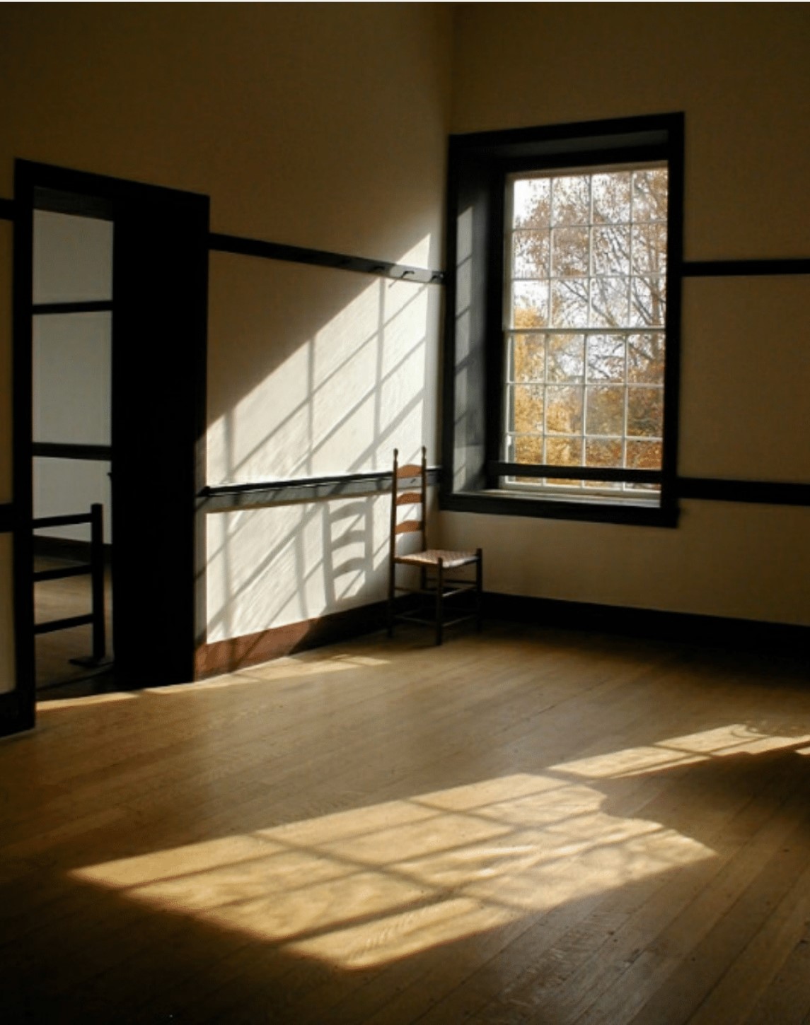
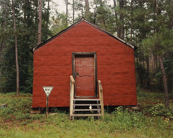
Canterbury Shaker Village was also just down the street from my house. I have always admired the group’s inventive nature and commitment to quality and craftsmanship and how the simple, restrained structures felt both modern and traditional at the same time. The structure, the anatomy of the architecture, and the post-and-beam logic of construction have stayed with me since I was a child - alongside the unforgettable interior spaces, which seemed laden with emotion. These spaces were restrained and tempered, serene and human in scale. The detailing celebrated the basic structure of things. There was a material presence; each space offered a beautiful quality of light; and you could feel the warmth of the sun pouring in and the heat the wood stoves. The essence of these architectural qualities – straightforward construction, real materials, simple forms, and mood – was what created such a sensorial experience.
My mother was also an artist and illustrator, and throughout my youth, my parents took me to every museum in the northeast countless times. Because of that, I cannot help but think of American Painters such as Andrew Wyeth, James McNeill Whistler, and Winslow Homer, while contemplating architecture through this lens. (I have been very interested in the connection of American Painting and architecture - a train of thought that has been slow cooking for some time.)
Their paintings resonated with me - they seemed honest, authentic, natural and familiar. In revisiting them, I realize that their landscapes, buildings and interiors are realizations of a common collection of elements that create an emotional connection for me. In both the subject’s material making and in the actual representation of the subject, they all convey a sense of history, place and time, texture, temperature, weather, and place within the landscape. The same qualities that you can find in the house I grew up in, or the Shaker buildings down the street for example.
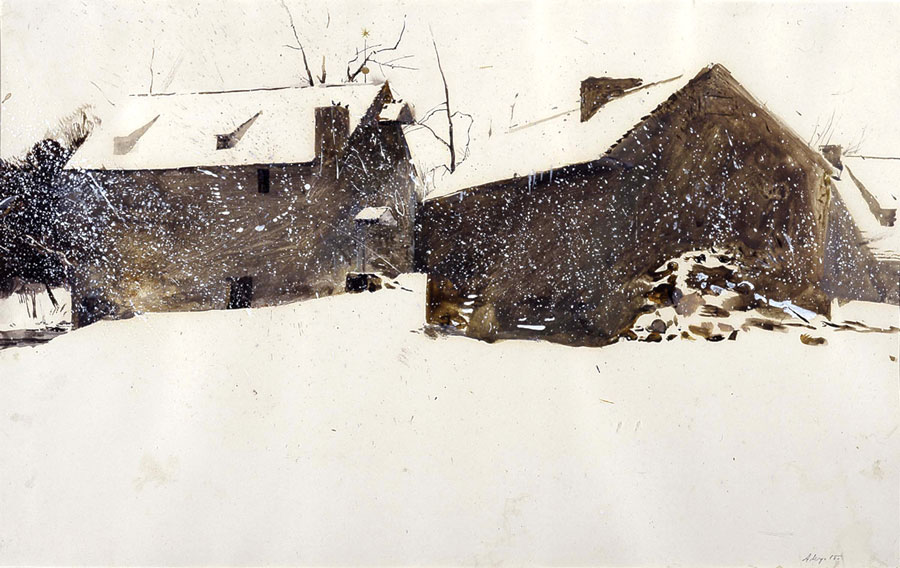
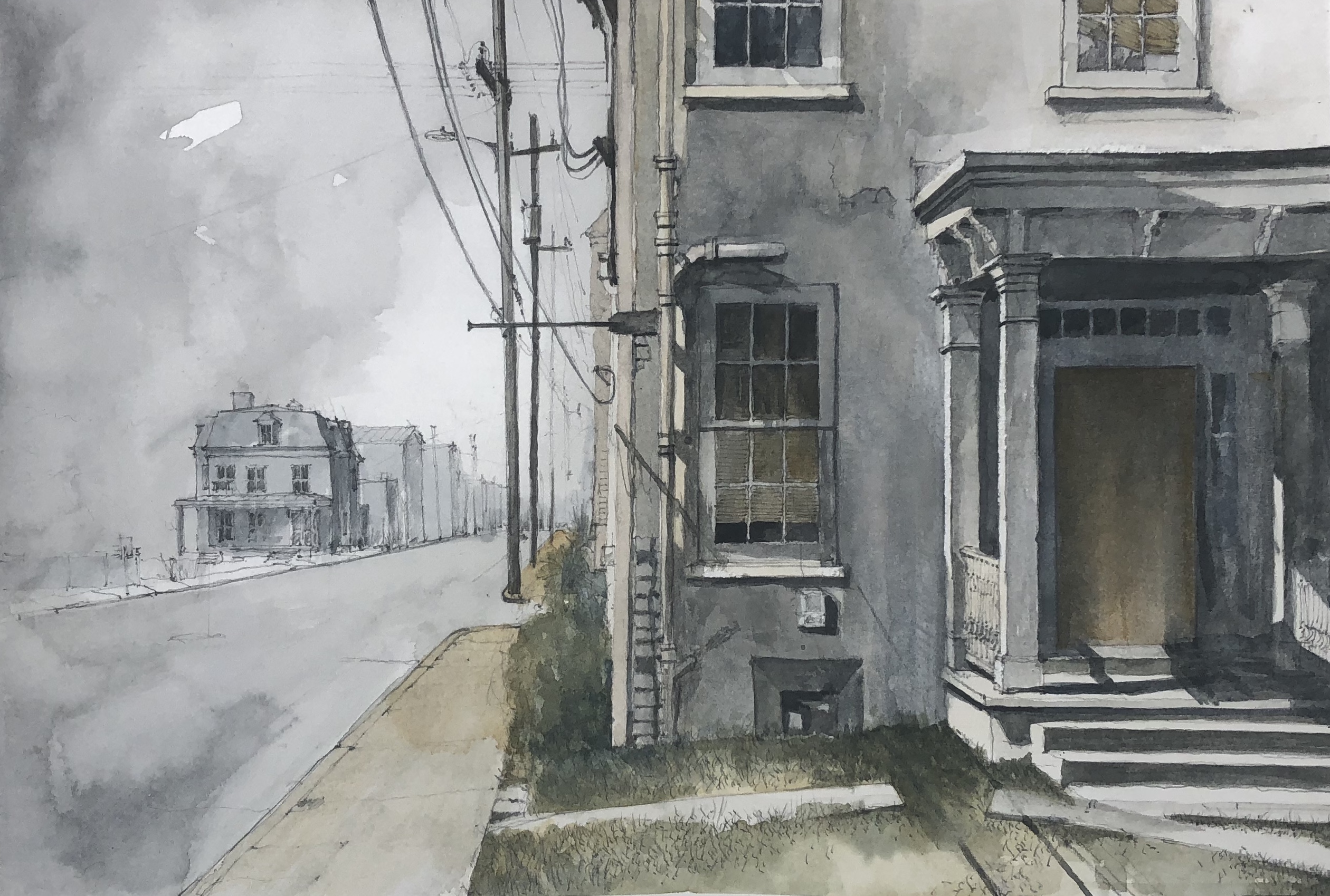
Andrew Wyeth’s paintings are particularly evocative to me. In the above image, you can see the beauty of the simple vernacular barn buildings, but you can also clearly see the even northern light and practically feel the weather in motion, as he splatters paint on the canvas to represent the wind and falling snow. The use of earth tones and the muted color palette also make the scene feel as if it has been completely calibrated.
I have been very interested in the connection of American Painting and architecture - a train of thought that has been slow cooking for some time.

Similarly, you can feel the warmth of the light, texture, material and human presence in his paintings of interiors. The window functions as a threshold moment and as a device to give one a sense of the weather, the season, the time of day. One can also feel the human presence in the space through the furniture and assorted objects.
Most importantly the architecture is always subordinate to the landscape.
Melissa grew up in South Carolina, and instinctually, the old barns and raised cottages of the South serve as natural references as well. The fine art photographs by an artist and a sculptor William Christianberry exemplify the beauty of these simple buildings. The vernacular quality and honesty of materials is quite beautiful, but they also possess a sense of history and patina and memory. We believe these elements are essential ingredients in the chemistry of space.
We feel displaced without the presence of history in our environment.


In the evolutionary course of the office, we are now trying to take something instinctual and transform it into something more deliberate. As a result, we have started cataloging what we call ingredients that make up the “chemisty of space.” These are common elements mined out of Shaker buildings, vernacular buildings of the South, and contemporary architectural spaces that we like – alongside qualities found in early American paintings. Admittedly, this is a paradoxical form of research. As Mark Wigley said, “atmosphere is what precisely evades analysis.” However, we believe a conscious awareness of these elements will inevitably help thicken our design work.


Travel drawing and painting has always served as the foundation for my creative process. As of late, I have used those ingredients to start making new paintings and drawings as a way to explore these more ephemeral qualities of space – aspects that I might have overlooked at an earlier time in my life, when I was mostly focused on the subject itself and its formal constructions and details. I am thinking: how can we draw and paint spaces that will inform future design work that respects, accepts, conjures, or amplifies such atmospheres and emotions?
I am thinking: how can we draw and paint spaces that will inform future design work that respects, accepts, conjures, or amplifies such atmospheres and emotions?
Ultimately we hope that these tools will help move the work past an aesthetic that is solely about formal expression into a more dynamic architecture.
The Exhibit
Korach Gallery - University of Miami School of Architecture


THE MAGALA RESIDENCE
Coconut Grove, FloridaThis project included the renovation of – and addition to – a rare case study house (designed by Trip Russell in 1948). Notably, the existing home was small – only 1,100 sf with one bedroom/bath.However, it was located on a large lot, which allowed for expansion on the site and made preservation of the existing home possible.The completed project now includes approximately 4,000 sf, with three bedrooms and 3.5 baths. With a large ficus tree in the center of the property, we designed two additional wings on either side of the original house one-story kitchen wing and a two-story living/bedroom wing), ultimately creating a courtyard condition. Given that the two-story wing was larger than the existing structure, it was critical for the new building to appear as lightweight as possible. The reading of concrete (an almost universal residential structural system in S. Fla) would have been too heavy against the reading of the low-slung wood roof of the original house. We sought a lighter, quieter solution, creating a hybrid of concrete,steel and wood structural systems that spoke to Russell’s original design. Most importantly, the ethos of the original house remains, while the new construction furthers the tropical nature of the project. Each wing, including the original structure, is only one room deep (in fact very narrow, at only 15’ wide) with expansive glazing opening onto the courtyard. Every room is intimate in size,filled with natural light and offers immediate views of the ficustree. (The two upstairs bedrooms also feel as if they are nestled within the site’s existing tree canopy.)The warmth and simplicity of the material palette were also preserved. The exposed beams and outriggers of the existing structure were kept intact, despite the necessary requirements tobring the home up to today’s more stringent building code (insulation was added on top of the existing roof). The exposed wood detailing was also carried into the new kitchen wing. Russell’s design also featured concrete floors, which were refinished and continued throughout the new construction. The original brick fireplace was also preserved and remains the heart of the house.
![]()
![]()

DRONE’S BEACH
2015 MoMA PS1 Young Architects Program, Long Island City, NYEach year, The Museum of Modern Art and MoMA PS1 selectfive finalists to make proposals for a outdoor recreational area in MoMA PS1’s large courtyard space. The objective is to provide concert goers and weekly museum visitors with space that integrates shade, seating and water. Rather than suggesting a pure object or a skyscape or landscape that could be inserted into the existing space (as in years past), we proposed transforming the space as a whole - to create a transporting and multi-sensory experience. Using the beach as both setting and conceptual framework, we integrated physical architectural interventions,visual imagery of the beach, smells, and evocative tactile elements to create atmospheric dimensions and engage the senses.Arched wooden ribs (which suggested the idea of a vessel) were attached to the courtyard’s existing concrete walls - increasing the height and formal nature of the space. The newly articulated surface was lined with imagery of the sea and misting devices were integrated throughout, collectively creating a sense of being enclosed within a “waterwomb.” The ground-plane was to be transformed to look like pink sand and four futuristic palm trees were designed. Associative smells (a bay rum tree, a campfire,saltwater, and the interior of a sailboat cabin) were to be infused in different areas of the space to function as instruments for memory and navigation. Lastly, the music from the DJ would amplify the experience, and all five senses would be addressed. With some ambiguity, the project also spoke to the transformation of static urban environments into participatory, performative social spaces, recognizing that media is now an everyday factor inthe urban experience. (So often people have their heads buried within their phones, ignoring their surroundings all together, or are too busy taking pictures of themselves – documenting that “they were there” rather than actually experiencing the space.) Therefore, drones – offering multiple dimensions of reality - were integrated to capture photographs of visitors in that space, to be posted immediately through social media. They also captured the overall space through aerial photography (to be live streamed in the courtyard), offering new perspectives, vantage points and ways of understanding one’s environment.


BRILLHART HOUSE
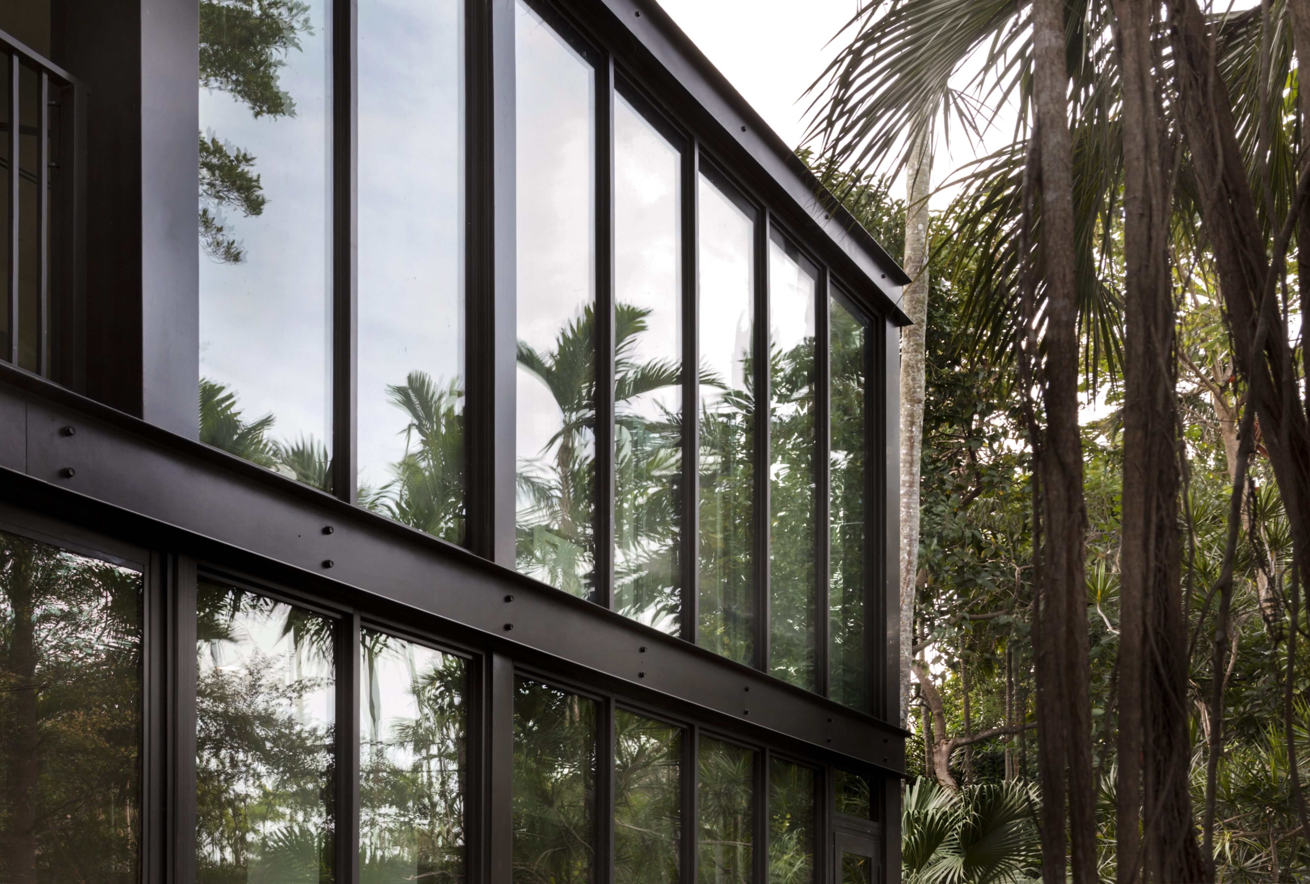
Miami, FloridaThe design for our house relies on a back-to-the-basics approach– specifically studying old architectural models that care about good form but are also good for something. Each design decision was organized around four central questions that challenge the culture for building big: what is necessary; how can we minimize our impact on the earth; how do we respect the context of the neighborhood; and what can we really build? Some answers came from a place with which we are already intimately familiar – the seemingly forgotten American Vernacular, and more specifically, the Dog Trot, which for wellover a century, has been a dominant image representing Florida Cracker architecture. The small, simple, and practical building is both modest and rich in cultural meaning. It attempts to maximize efficiency, space, and energy; relies on vernacular building materials; and celebrates the balmy breezes.The principles of Tropical Modernism also offered direction.The architects building in South Florida’s postwar period turned to local landscape, climate and materials to inform their designs, marrying building traditions with passive systems, new technologies, and innovative construction techniques. In that same spirit, we sought an alternative to the use of concrete and concrete only, instead exploring steel and glass as the superstructure. As a result, we wasted fewer materials, simplified the assembly, and reduced the cost and time of construction, all the while allowing for increased cross ventilation and a heightened sense of living within the landscape.Elevated five feet off the ground, the project includes 100 feet of uninterrupted glass – 50 feet spanning the full length of both the front and back sides of the house, with four sets of sliding glass doors that allow the house to be entirely open when desired.The house also includes 800 square feet of outdoor living space,with both front and back porches and shutters along the front façade for added privacy and protection against the elements. These details, and the position of the house, which is at the center of a 330-foot long lot, allow the house to meld seamlessly with the site’s dense and lush native landscaping. With interior and exterior spaces fused together, the experience is that of a floating tropical refuge.

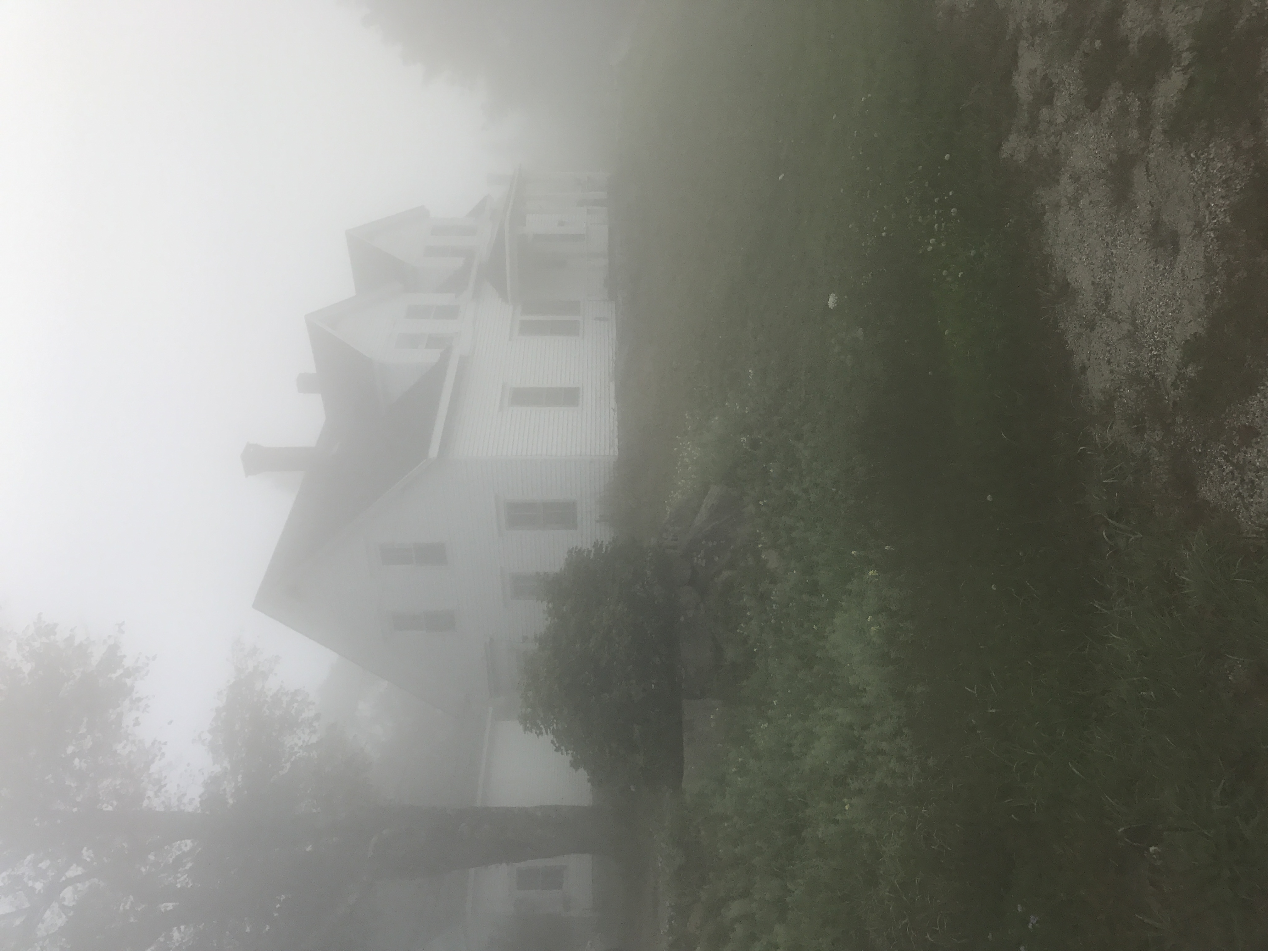
MAINE RESIDENCE
Stonington, MEWe treated this renovation project of a 1900s New Englander as if looking through the lens of Andrew Wyeth’s work: his paintings, with their heightened sense of contrast, depict an atmosphere that one can almost feel and touch. He also relies heavily on the window as both light source and picture frame to the (often snowcovered, rainy, cold) landscape beyond.As such, this project is about atmospheric preservation — largely focused around maintaining defined rooms and windows and the material presence of the space. It also offers a counter proposal to the current “old house” renovation — where individual spaces are abandoned for open floor plans and imperfections are erased with clean modern finishes. The overall layout and window openings were kept. The existing wood floors, rife with cracks and holes, were also kept – simply stripped and re-stained with a dark, rich stain. We kept the tin ceilings in their existing condition. Plaster walls were patched and repaired where possible, and painted bright white so as to contrast with the floors. We also kept the original window panes in lieu of replacing them with more insulated glass and tighter seals. Thus the house still feels “old”, it creaks and has a little draft – making us distinctly aware of the contrast between inside and out; of weather and age; the bitter wind and warmth inside. In celebrating the existing spatial and experiential environments, we were also able to preserve the history of the building and honor the home’s already heightened sense of light and darkness. In this case, the historically defined spaces are made modern not by “opening them up” but by giving them a simple “blood transfusion” – new plumbing, electrical, new appliances, and contemporary millwork details.

125th STREET RESIDENCE
Pinecrest, FloridaThis single-story, 6150 sf residence is designed as a courtyard complex comprised of six narrow building structures, each one room deep. Five pocket gardens, nested around the perimeter, help to break up the façade and inject landscape throughout the entire project. The buildings are covered by a single continuous roof, featuring pre-cast concrete “fingers” that cantilever 5’ overthe exterior façade. To counterbalance the rigor and rectilinear nature of the exterior, the interior space includes a more organic and curvilinear roof overhang.Extensive glazing on the inside perimeter orients you to the real heart of the house: a heavily landscaped courtyard featuring a 80-foot-long pool. The structural system includes steel columns, but the rest of the home is designed in concrete. The goal was to make the concrete structure feel both tropical and lightweight. We chose to cantilever the exterior walls (and thus in a sense recess the structural tie beam. To make the recesses “disappear” even further, we painted them a dark green. Cantilevering the roof slab with pre-cast concrete fingers also makes the building feel as if it hovers - and makes what is in reality a massive roof feel quite light.The façade is also tropical in nature, acting as an actual expression of the sun. The pre-cast fingers cast ever-changing shadows throughout the day.


SEAPLANE TERMINAL
DawnTown Competition, Miami, Florida
As both public art and aqueous architecture, the Miami Seaplane Terminal, known as the Stilted Buoy, is conceptually tethered to Miami’s memory of building and landscape in Biscayne Bay. Looking back to the future, the Stilted Buoy is inspired by the resilience of Stiltsville and the iconic aerial resonance of Jeanne Claude and Christo’s 1983 electric pink Surrounded Islands project. In siting the seaplane terminal in the water, the project accepts the inescapable realities of nature by giving the land back to Biscayne Bay. The translucent terminal wing, propped out of the water, is designed to offer a new model for amphibious architecture, a modern-day Stiltsville understood in the contemporary context of climate change and rising sea levels. Meanwhile, its luminous pink legs and platform, visible underneath a shallow depth of Miami’s azure blue sea, resurrects and completes the idea of the Surrounded Islands project. Not only does the layering of pink apply the “true color of Miami” to the one island that was previously too large to wrap, but it also completes the terminus of the axis of the original Christo design, which followed the chain of natural barrier islands. As Christo said, “the color also allows this project to be seen, approached and enjoyed from the land, the water, and the air.”Made of translucent concrete, the structure also offers a counterpoint to Miami’s corporate condo-dominated glass skyline. In the early morning and later afternoon hours when the sun is low, the building appears translucent, like a jellyfish, only later to be perceived as a white concrete wing. A land-based hangar building addresses the primary needs of the airport, including drop-off and pick-up, passenger screening, and storage. The Stilted Buoy serves as a main gate and observational tower. Like traditional terminals, it offers panoramic views of Miami’s green-blue waters and incoming seaplanes, but will also feature port commercial space, a restaurant and a ground control tower to provide additional security into Government Cut. The building will also serve as a water-taxi stop, so passengers arriving by plane can be delivered across the waters to the beach, the mainland, and beyond.


THATCH HOUSE
Eleuthera, BahamasLocated on the wild Atlantic coastline of Eleuthera and perched on a cliff overlooking a private beach, this outpost is both eco-resort and surf camp. Inspired by the experimental Hatch House(Jack Hall, 1960) on Cape Cod’s Natural SeaShore, the project is a combination of volumes and outdoor decks that dissolve within the landscape.The dog-trot plan includes an East-facing living / kitchen volume, with a large picture window framing the view of the Atlantic Ocean. The bedroom / bath is located in the rear volume,offering views of the untouched hillside to the North. The South facade is solid to shelter views of an adjacent building on the property. Connecting the two spaces is a north-facing porch and a central, covered outdoor sitting area. This small court acts as the formal entry into both spaces, and its central location allows one to enjoy the weather, protected from the wind and spray off the ocean. Operable flaps and shutters (maneuvered with nautical hardware and rigging elements) are used along the porch and infront of all the window openings. These devices provide shade and control breezes while also adding security while the retreat is unoccupied. Slightly raised above grade, the building is constructed of western red cedar and thatch and a cedar-paneled interior. The re-treat fades into its surroundings, thanks to the lightness of the structure, use of natural materials, and the open penetration within the design. The home is entirely off the grid, complete with solar panels and a cistern that provides water to the site.


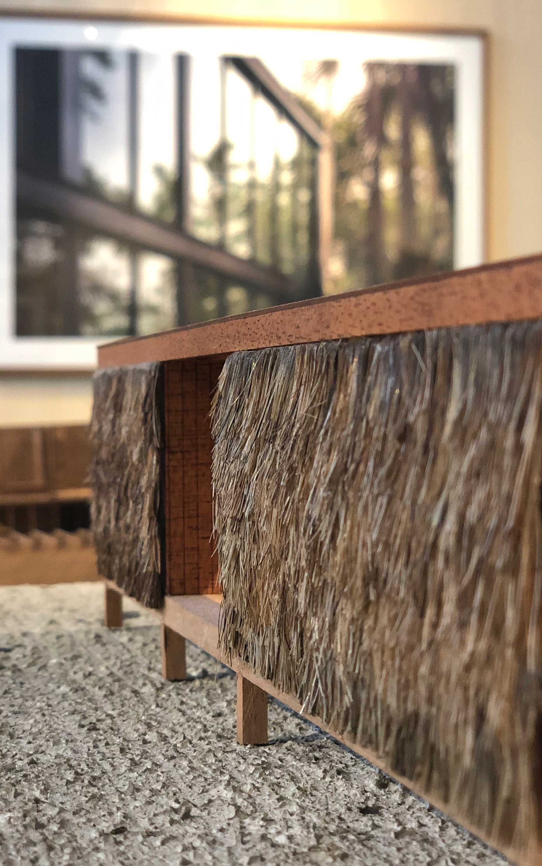
THE BRILLHUT
Eleuthera, BahamasThis 600 square foot cabin is a project for ourselves – an adventure into the out-islands of the Bahamas. The intent is to provide a “small house / big life” experience where one can trade in the ailments of modern life for the rewards of outdoor living. Our goal was to also create a place that is both contextual and somehow familiar, resuscitating the Ancient while celebrating the Modern. The building relies on the instinctual logic of the primitive hut; references the gabled cottages of nearby Harbour Island; and abstracts and reduces the Creole Cabinet-Loggia typology.Screened on three sides, the downstairs acts as both “loggia”and living space, offering transporting views of seagrapes, pinetrees, and the Atlantic beyond. The sleeping areas and bath-room are located in a secondary “cabinet” in the eaves, where two sculptural skylights above the beds orient views towards thenight sky. Small picture windows – at eye level of the beds - provide ventilation and more poetic, framed views of the blue horizon. A material palette of western red cedar and cedar shingles blends seamlessly into the landscape.The 14’ x 22’ x 30’ structure was designed to be pre-fabricated,flat-packed, and shipped in a 40-yard container. An innovative structural design strategy merges traditional stick-frame and post and beam construction to reduce waste and allow just two people to assemble it on site. Operable flaps, made of lightweight fiberglass and foam insulated panels, can be manually operated by a single person using a pulley system. When open, these flaps provide shade and rain protection for the interior and covered outdoor space for the deck. When closed, these panels provide structural stability, security, and protection against the elements.

